Mobile First Facebook Ads Landing Pages for DTC That Pass Pixel & CAPI
A Facebook ads landing page has to do four things at once: match the ad’s exact promise in the headline, load in under three seconds on mobile, present one clear action above the fold, and feed clean data back through the Pixel and Conversions API. Miss any of those, and the page fights the algorithm instead of working with it. Everything else, copy angles, color choices, testimonial placement, is secondary to getting that foundation right.
TL;DR:
- A Facebook landing page must match the ad’s promise exactly, load in under three seconds on mobile, and feature a single clear action above the fold for optimal conversions.
- Designing pages with minimal form fields, using mobile-first layouts, and testing live on actual phones significantly reduce abandonment and improve results.
- Proper tracking with Pixel, Conversions API, and capturing the Facebook click ID ensures reliable attribution and prevents under-reporting of conversions.
- Compliance with Meta policies and FTC disclosure rules, including functioning URLs and clear labels for advertorial content, is essential to avoid campaign rejection.
- Using pre-built templates, aligning ad creative with page copy, and iterative testing of headlines and CTA buttons can dramatically increase conversion rates while optimizing ad spend.
Table of Contents
- What Is a Facebook Ads Landing Page (And When Should You Use One)?
- The Anatomy of a Facebook Landing Page That Actually Converts
- How to Build a Facebook Landing Page Step by Step
- Tracking and Attribution: Pixel, CAPI, and Capturing fbclid
- Meta Ad Policy and FTC Disclosure Rules You Can’t Skip
- Testing and Optimization: What to Test First and What to Measure
- Pre-Launch Checklist: What to Verify Before You Turn on Ads
- What My Team at Cosma and I Have Learned Running DTC Campaigns
- How My Team at Cosma Can Help You Build Pages That Convert
- Sources
- FAQ
What Is a Facebook Ads Landing Page (And When Should You Use One)?
A Facebook ads landing page is a standalone page built for a single campaign objective, separate from your homepage or standard product page. It exists to do one job: convert the specific person who clicked a specific ad, with no navigation menu, no competing offers, and no detour to browse the rest of your catalog.
That’s different from a product page, which has to serve organic shoppers, returning customers, and paid traffic all at once, and different from Facebook Lead Ads, which capture a name and email without ever leaving the platform. Practitioner comparisons consistently note that Lead Ads work best for low-friction, high-volume capture, while dedicated landing pages win when you’re selling something higher-ticket, need cleaner attribution data, or are retargeting a warmer, mid-funnel audience that already knows your brand.
Which format you build depends on where the traffic is coming from:
- Advertorial or listicle style for cold audiences who don’t know you yet. These pages read like editorial content first, pitch second, which softens the jump from scroll-stopping ad to sales page.
- Direct product or offer page for warm retargeting audiences who’ve already seen your brand and just need a reason to act now.
- Quiz or interactive format for categories where personalization (skin type, fit, goals) increases perceived relevance before the ask.
Pick the format based on funnel stage first, aesthetics second.
The Anatomy of a Facebook Landing Page That Actually Converts
Every high-performing page I’ve seen shares the same skeleton underneath different branding. Strip away the visual polish and you’re left with five components that do the actual conversion work.
1. A headline that repeats the ad’s exact promise. If your ad says “40% off your first order,” the headline can’t say “Premium Skincare, Reimagined.” That gap between what someone clicked and what they landed on is where most conversions die. Meta’s own delivery system rewards continuity here too: message match is evaluated algorithmically and tight semantic overlap between creative and headline reduces delivery throttling, which means cheaper impressions on top of a better user experience.
2. Social proof positioned within eye-shot of the CTA, not buried below it. A star rating, a review count, or a single sharp customer quote sitting next to the button does more work than a testimonials carousel three scrolls down. By the time someone scrolls that far, they’ve already decided.
3. One CTA, repeated, never competing with a second offer. Multiple asks on one page split attention and tank conversion rate. If you have two audiences with two intents, build two pages.
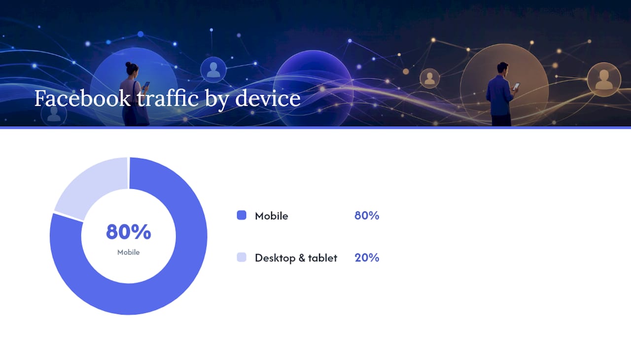
4. A mobile-first layout with compressed, appropriately sized media. More than 80% of Facebook traffic arrives on a phone, and the platform’s own guidance is blunt: pages need to load in under three seconds on mobile or you’re paying more for worse delivery. Design at 375px width first, then scale up, not the reverse.
5. Forms short enough that abandonment doesn’t eat your budget. Two to three fields, name, email, maybe phone, covers most lead-gen needs. If you genuinely need more information (financing applications, consultations, custom quotes), break it into a multi-step form instead of one long page. Each step feels smaller than it is, and completion rates hold up better than a single monolithic form.
Pro Tip: Test your page on an actual phone over 4G, not your office Wi-Fi on a laptop. The gap between how a page feels on a fast connection and how it performs on a real customer’s phone is where most speed problems hide.
Ecommerce and DTC pages that skip straight to “buy now” without any of these five elements in place are usually the ones burning ad spend on traffic that never had a reason to convert.
How to Build a Facebook Landing Page Step by Step
Building a page that actually performs isn’t complicated, but the order of operations matters. Skip a step and you’ll end up rebuilding later.
- Choose the format for your objective. Cold traffic and a new product launch usually call for advertorial or listicle style. Warm retargeting and an established offer call for a direct sales page. Decide this before you touch a template.
- Pick a template that matches, don’t build from scratch. Practitioner guides consistently point to template-driven builders like Leadpages or Unbounce because they’re pre-optimized for mobile speed and let you swap creative fast without touching code.
- Map your ad creative to page elements before writing copy. If the ad hook is “Still dealing with X problem?”, the headline should answer that question directly, not pivot to a generic brand statement.
- Write microcopy that mirrors the ad’s language. If the ad uses “ships free,” the page says “ships free,” not “complimentary shipping.” Small wording shifts break message match more often than people realize.
- Compress every image and video before upload. Target file sizes under 200KB for images where possible, and always test the compressed version on mobile before publishing. A crisp hero image that adds a full second to load time is a net loss.
- Build the form with a hidden fbclid field. This single field is what lets your CRM pass accurate click data back into a server-side Conversions API later. Skip it now and you’ll be reconstructing attribution manually.
- Connect the form to your CRM or email platform and test the submission end-to-end. Submit a real test entry and confirm it lands where it should, with the fbclid value intact.
- Publish and connect the domain. Most template builders let you go live in minutes once the page is built; there’s no reason to over-engineer hosting for a single-campaign page.
A few things to double-check before you call it done:
- Headline and hero image match the ad creative exactly, not approximately
- CTA button color contrasts against the background (don’t rely on brand color alone)
- Form fields are the minimum needed to qualify or capture the lead
- Page has no top navigation bar that lets visitors wander off before converting
Once it’s live, the workflow doesn’t stop. The best-performing DTC pages I’ve seen get rebuilt or refreshed every few weeks as creative rotates, which is exactly why template-driven workflows matter for iteration speed: the faster you can spin up a new creative-and-page combo, the longer you delay creative fatigue.
Tracking and Attribution: Pixel, CAPI, and Capturing fbclid
Accurate tracking is the difference between optimizing toward real conversions and optimizing toward noise. Since Apple’s App Tracking Transparency rollout, the Meta Pixel alone under-reports conversions on a meaningful share of iOS traffic, because users who decline tracking simply don’t get counted by browser-side signals.
The fix is a dual-stack approach: Pixel for browser-side events, paired with server-side Conversions API (CAPI) for the events the Pixel misses. CAPI sends conversion data directly from your server to Meta, bypassing the browser limitations entirely.
The piece that ties it together is fbclid, the click identifier Facebook appends to your landing page URL when someone clicks the ad. Capturing that value in a hidden form field and passing it through to your CRM means you can match a form submission back to the exact ad, ad set, and campaign that generated it, even days later when the actual purchase happens outside the browser session.
Set this up before launch, not after:
- Install the Pixel on every page, and confirm firing with Meta’s Test Events tool before spending a dollar
- Configure CAPI through your platform’s native integration or a tag manager, and verify events show up in Events Manager tagged as server-side
- Add a hidden fbclid field to every form and confirm it’s populating on a live test submission
- Map each conversion event (lead, purchase, add to cart) consistently across both Pixel and CAPI so they’re not double-counting or under-counting
Statistic Callout: With over 80% of Facebook traffic arriving on mobile, any tracking gap on mobile browsers, where ATT-related under-reporting is most common, distorts your entire optimization signal, not just a slice of it.
If conversions in Ads Manager look lower than what your CRM or Shopify dashboard shows, that gap is almost always a tracking setup problem, not a page performance problem. Check Test Events first before you touch the page itself.
Meta Ad Policy and FTC Disclosure Rules You Can’t Skip
Compliance failures are one of the most common, and most avoidable, reasons a landing page tanks a campaign before it even gets a fair test. Two sets of rules matter here: Meta’s own platform policies, and the FTC’s advertising disclosure requirements.
Meta requires that your destination URL actually functions: no broken links, no 404s, no content behind a login wall. Pages that fail this basic check get flagged for rejection regardless of how good the creative is. Test every link before you submit the ad, not after.
On the disclosure side, if you’re running an advertorial-style page, one that reads like editorial content before it pitches, the FTC’s native advertising guidance requires a clear “Advertisement” or “Sponsored” label visible near the top of the page, not buried in a footer or in small gray text.
A few guardrails worth building into your copy review process:
- Never make health or efficacy claims you can’t substantiate, even implicitly through before/after imagery
- Keep pricing and offer terms on the landing page matched exactly to what the ad states
- Label advertorial content clearly at the top, not just once in the fine print
Testing and Optimization: What to Test First and What to Measure
Not every test is worth running, and testing everything at once tells you nothing. The order below reflects where the biggest conversion swings usually hide, from highest impact to lowest.
- Headline and message match. This is almost always the highest-leverage test because it affects both conversion rate and Meta’s delivery efficiency simultaneously.
- CTA copy and button placement. “Get My Discount” versus “Shop Now” can move click-through meaningfully, especially when it echoes language from the ad itself.
- Hero image or video. Swap the primary visual before touching secondary page elements, since it’s the first thing every visitor sees.
- Social proof placement and format. Star rating versus review count versus a single quote, tested near the CTA specifically.
- Form field count. Removing even one non-essential field can measurably reduce abandonment on mobile.
Run one variable at a time, and don’t call a test early. A test that hasn’t reached a stable sample size in each variant is just noise dressed up as a result; give it enough volume and enough days to smooth out day-of-week swings before deciding.
Watch four numbers throughout: landing page views (not just link clicks, which count anyone who clicked before the page even loaded), conversion rate, cost per acquisition, and return on ad spend. A page with strong landing page views but weak conversion tells you the ad’s promise and the page’s delivery aren’t lining up, which almost always traces back to message match.
Pro Tip: If you’re short on testing volume, start with the headline. It’s the single highest-leverage change on the page, and it’s also the fastest to implement, no design work required, just copy.
Pre-Launch Checklist: What to Verify Before You Turn on Ads
Run through this before enabling spend. Most wasted ad budget traces back to one of these being skipped, not to bad creative.
- Headline matches the ad’s exact language and offer
- CTA is visible above the fold on an actual mobile screen, not just desktop preview
- Page loads under three seconds on mobile over 4G, tested live
- Pixel and CAPI are both firing, confirmed in Test Events
- fbclid field is present and populating on form submissions
- Privacy policy link is visible if you’re collecting any personal data
- No top navigation bar that gives visitors an exit route
- Form submission tested end-to-end into the CRM
- Every link on the page checked for 404s or broken redirects
| Check category | What to verify | Why it matters |
|---|---|---|
| Message match | Headline mirrors ad copy exactly | Drives both conversion and delivery efficiency |
| Speed | Loads under 3 seconds on mobile 4G | Directly affects Meta ad delivery quality |
| Tracking | Pixel, CAPI, and fbclid all confirmed live | Prevents under-reported conversions |
| Compliance | No broken links, disclosure visible if advertorial | Avoids ad rejection and FTC exposure |
What My Team at Cosma and I Have Learned Running DTC Campaigns
When budgets are tight, I prioritize page changes over new creative almost every time. A weak page kills good creative faster than weak creative kills a good page, and most brands have that backwards.
The most avoidable mistake I see in brand-built pages is message mismatch: an ad that promises one thing and a page that opens with brand storytelling instead. It’s a five-minute fix with an outsized payoff.
Iterate yourself while you’re testing headlines and CTAs. Bring in outside help once you’re troubleshooting delivery issues tied to tracking gaps or scaling spend past what your current page-and-creative combo can sustain without fatiguing.
— Stefano Mazzei
How My Team at Cosma Can Help You Build Pages That Convert
If you’ve read this far and you’re still staring at a blank template, that’s usually a sign the bottleneck isn’t knowledge, it’s execution bandwidth. At Cosma, my team and I build landing-page and creative combos specifically for DTC and ecommerce brands, structured around the same message match, speed, and attribution principles covered above, and matched to how Meta’s delivery system actually rewards clean signals.
We typically start with a short audit of your current page and tracking setup, flag what’s costing you delivery efficiency, and outline what a rebuilt page-and-creative system would look like before any commitment. You can see how that’s played out for other brands in our case studies, or go straight to booking a call if you already know you need hands-on help. Most engagements start with that conversation, not a long proposal process, so there’s a fast, clear next step if a DIY rebuild isn’t the right use of your time right now.
Sources
FAQ
Is $10 a day enough for Facebook ads?
It can work for testing a single audience or creative variant, but expect a slow learning phase; Meta’s delivery algorithm needs enough conversion volume to optimize, and small budgets stretch that timeline out considerably.
What is a landing page view on a Facebook ad?
A landing page view counts a click where the destination page actually loaded, as opposed to a link click that counts anyone who clicked regardless of whether the page finished loading.
What is the difference between landing page views and link clicks in Facebook ads?
Link clicks count every click on the ad’s link, including bounces before the page loads; landing page views only count visits where the page successfully rendered, making it the more reliable signal for diagnosing speed or hosting problems.
What is a good example of a landing page for Facebook ads?
A strong example matches the ad’s headline word-for-word, places a review or rating near the CTA, loads in under three seconds on mobile, and asks for no more than two or three form fields before the offer is claimed.


